Icelandair recently took “re-delivery” of one of its 737 MAX aircraft, now wearing its new livery. And predictably, opinions on it vary!
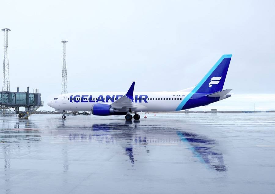
Colours are a big deal, to many people. Families have been known to argue for weeks, over the colour of the next family car! And that’s a bit ironic since they won’t even see it, as they drive along. But we digress. Unquestionably, a colour scheme or livery is a pivotal part of a brand’s identity. And whenever a company changes it, controversy is almost guaranteed.
Icelandair has had its new livery in the works for several months now. Its simpler “white on blue” tail logo has actually featured in all of its social media since last summer. But we hadn’t seen one of its aircraft in these colours, until earlier this week. The airline is taking deliveries of new 737 MAX aircraft. But the first plane to feature these colours is TF-ICE, i.e. the airline’s first 737-8. Icelandair calls it the “Jökulsárlón” (after a glacial lagoon), and it’s just a week short of its 4th birthday.
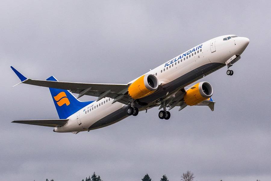
Icelandair New Livery – Description
The new Icelandair livery features navy blue as the predominant colour, over a white background. There will also be an accent colour that will vary from aircraft to aircraft. Previously, the airline’s livery combined blue with its signature orangey-yellow. The nerdier among us will also note that the belly of the planes had a more neutral aluminium-grey colour (see above).
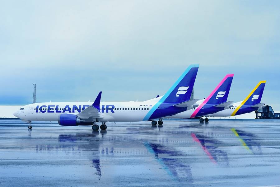
All this has made some aviation enthusiasts accuse Icelandair of oversimplifying its new livery. There is certainly some truth to the idea that simpler liveries cost less to the airlines. Often, it also means that the broader use of white paint makes the planes lighter. There are some caveats to this, but by the same logic, white aircraft are… greener!
But strictly speaking, the critics are factually wrong: the new Icelandair livery is NOT more white. It still has two colours – only now one of them (the accent) will vary. And previously, the fuselage was all-white (other than the belly), whereas now there is some blue, under the vertical stabilizer. If anything, having five different accent colours in the fleet (boreal blue, magenta, sky blue, yellow and green) makes the planes more colourful than before!
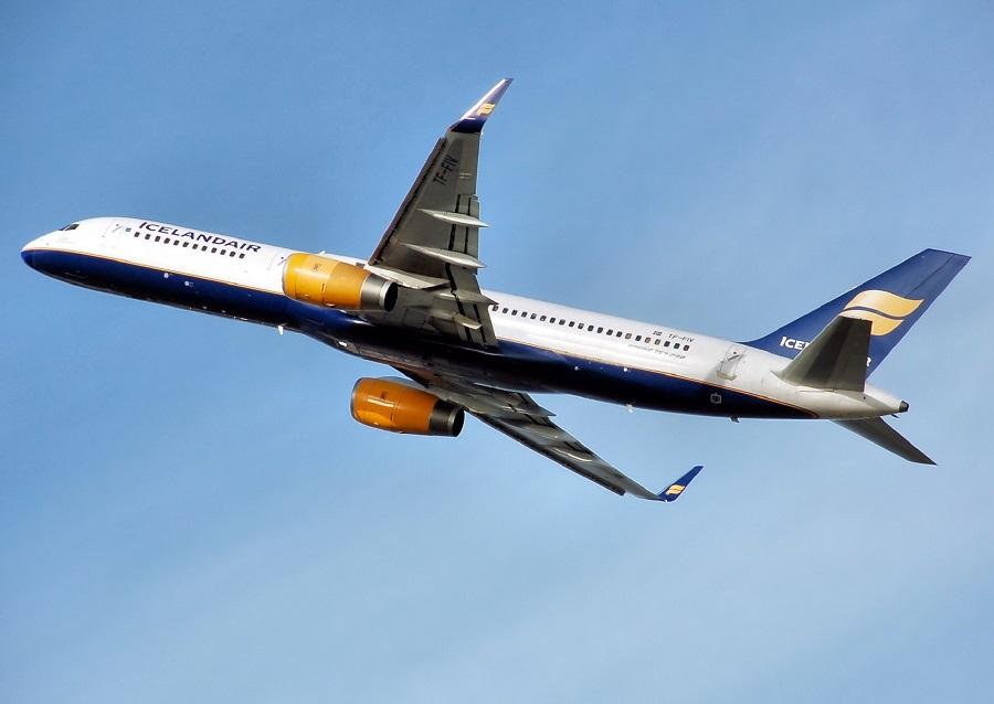
Simple Can Be Creative
Of course, it is true that there is a trend towards a more minimal, “less-is-more” approach to branding recently. The Icelandair tail logo in the old livery wasn’t just yellow; it also had shades & shadow effects. The white-on-blue is definitely simpler. Think Windows 7 “glass/aero” Vs Windows 8/10 “Metro”, if you like. But is this a bad thing?
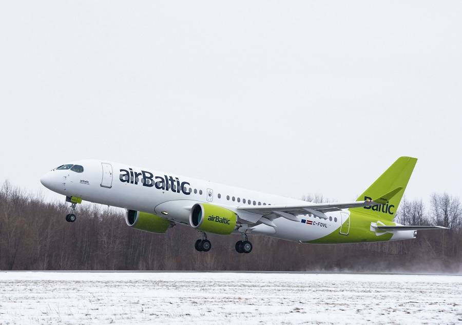
Beauty is in the eye of the beholder, as the overused saying goes. And even before Icelandair, we saw some new livery designs that were both simple and beautiful. airBaltic comes to mind. The airline’s previous colours combined white, lime green and grey/silver. Their new livery abandoned the silver (on the engine nacelles) and tweaked the lettering a bit. In this author’s subjective opinion, it’s one of the best single-colour liveries out there.
We have previously seen how and why airlines abandoned old iconic designs – including polished aluminium! It’s certainly true that airlines can’t ignore the economics of painting, in terms of weight and ease of maintenance. But brand identity is certainly important. And Icelandair would argue that its new livery, with two distinct colours on the tail, makes its planes stand apart.
This is the airline’s first complete redesign of its brand identity since 2006. It says that it aims to have five MAX aircraft wearing the new livery by the end of February. It will then continue repainting the fleet at a slower pace, following each aircraft’s maintenance cycle. Icelandair will take delivery of four 737-8s in the next few months, that should come wearing the new livery.

